365 Half-Monthly Pages for 2014
These were printed at Persnickety, and I loved them! I bought a pre-paid package and it was so worth it, much more affordable than I can get them here in Singapore, even including postage.The photos don't do them justice, the colors were beautiful, and the clarity and details were fantastic!
Here's how they looked added to my Project Life album in 12x12 pockets.
The size of the half-monthly photos are just right, not too small and big enough to see the details!
And finally, my entire 2014 in one album binder - just perfect!!
Actually earlier I thought a lot about what I would do for 2014's memory keeping. My main concern was that my storage space is limited in my smaller new home, and may not be able to accommodate even one PL album binder each year in the long run. But I love my current process and can't think of any other way I would want to go about it, so I'm continuing with it for this year! :)
Lined/Graph papers used:
Rebecca asked me in the comments what are the background papers I used in these pages: Well a lot of designers include such papers in their kits nowadays, so I use various, but I especially love Allison Pennington's 'Patterns & Backs' and 'Ledgered' packs, and Digital Design Essentials' 'Noteables' and 'Notebook Essentials' packs.
Anniversary Photobook
I've finally completed my 20th Anniversary Photobook. The first 19 years' pages were posted earlier in this post, and here is finally the 20th year:I've also added a few more themed pages to the album, this one is about us being Beach lovers, or beach bums :)
About the institution of our date nights over the years
About our families
and life long friends too
and finally a last page - some of our hair and fashion misses in the past - what were we thinking??
So this is love :)
Re-hashed my valentines heart shape template for the cover
Here's the back cover
You can see the entire set of my layouts for my Anniversary Album here!
Beijing Photo Book
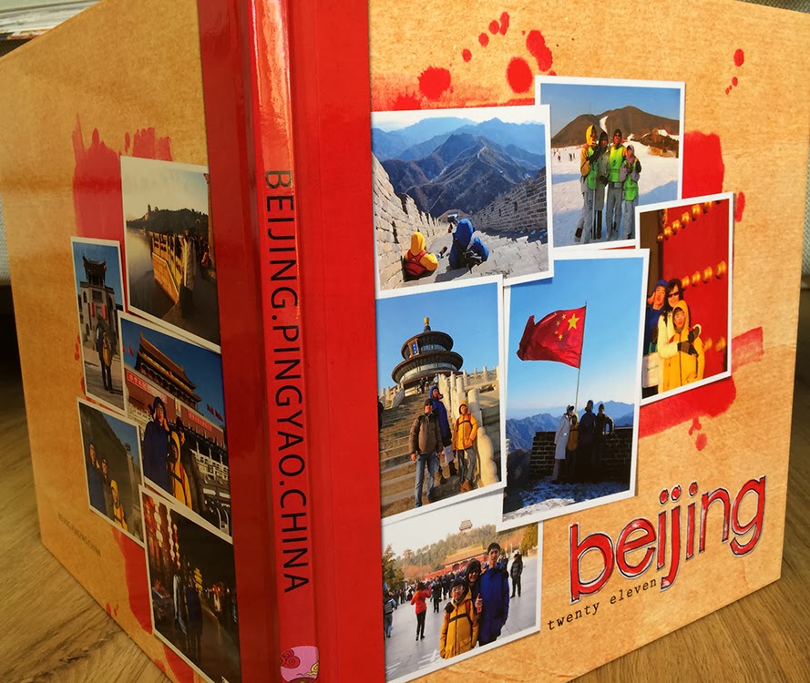
I received my Beijing Photobook back from Shutterfly!
As usual, it is lovely and the colors are brilliant. I'm so used to Shutterfly and have not been disppointed, so have stuck to them though so many other printers are out there. I guess I'm just lazy to try to figure out how another printer's program works!
Having said that, my friend Jenny had highlighted that when she printed recently, even though she followed Shutterfly's guidelines on dimensions, when her book was printed, there was a dark line near the spine on the cover. With her warning, I tried increasing the width of the spine jpeg to 1.573 inches (shutterfly's guideline is 1.437 inches). This is the result:
If you look carefully, you will see there is indeed a very thin dark line where the cover bends when you open it (where the cover design and the spine design meet). It is not obvious, but is there. I'm not sure how to solve this either. I might try increasing the width even more on my Anniversary Album when I get it printed and see how it turns out.
There is no such dark line on the back cover though.
Overall, the book looks just great, exactly how I imagined it would when I was designing the cover!
Here are some of the inside pages so you can see how the double pages show up. I'm still using the method I've always used, of allowing about 3/8 ths of an inch overlap on the left and right side jpegs that I upload (see more explanations here and here) and it has so far worked for me. Bear in mind though that my album is 98 pages!
In this page below, as you can see, if you have text running across the page, it gets quite tricky to be able to get the words lines up and be able to read them. Mine turned out okay, but there was some slight overlap - I was prepared for it and did not mind. But if you are particular, it would be best not to journal across the the page!
One more album added to my lot. This sight makes me so happy!
Hawaii Pages
And I've gotten started on my Hawaii trip photos! Always a thrill to start a new project.
Process
For this photobook, to simplify and to unify, I've decided to use only background papers that are wood themed. So before I started, I searched through my hard disks and copied all the wood-themed papers to a folder on my computer named 'Hawaii papers and embellishment's. Similarly searched all my stash for beach/hiking/hawaii themed kits and copied them to the same folder. Now I'm ready to roll!
1st page is on the evening right after arrival in Honolulu, where we went for the free Kuhio beach hula show. It was December and the weather was fantastic, not to mention the sunset, the music, the performances and the amazing feeling that we are in Hawaii!
The next morning we went to hike DiamondheadAt the peak - oh the views! And when we came back down, we tried the shaved ice - interesting as back home we have a local traditional Singapore version called ice kachang that we thought was original to us!
Then we spent the afternoon on a more isolated section of the beach - on the sand again - but on the other side of the earth! - how amazing
These templates can be found in the store at 20% off for 3 days only!
Also on this trip we transited in Korea, and spent 13 hours in Seoul - our first time - it was fascinating - we must visit one day!


Wow, everything is so gorgeous and you're so up to date! You rock! Regarding the line on the shutterfly book spine, could it be that is their attempt at a drop shadow? That's what it looks like to me at first glance - just a guess as I've never seen one in person. I always print my pages as 12x12s at persnickety, I've never tried a photo book.
ReplyDeleteThanks Tana! It does not seem like a drop shadow close up unfortunately. But it is not obvious so it's all good for me!
DeleteI was just going to suggest the same thing. They might want to make it look like a drop shadow. And that's the reason it is not on the back cover as the angle is different. Just a guess.
ReplyDeleteLove it all, Yin! :) Sorry you ended up with the little black line on your book cover too. I'm not sure what the deal is with that. ?? I just got a book printed from Adorama Pix, and it is LOVELY! I am so pleased with it, I think I will print my next book with them as well. The lay-flat pages are so great! I need to do a blog post about it... ;) Thanks for yet another terrific template!
ReplyDeleteWould love to see your post about the new book!
DeleteThanks so much for the lovely template! I like seeing all your layouts and photobooks.
ReplyDeleteThanks Sue, so nice to hear from you!
DeleteYou have such lovely double pages and templates and you are my inspiration. Thank you!
ReplyDeleteReally appreciate your leaving lovely feedback!
DeleteI have recently discovered your templates and am in love. Now just to decide on which of your templates to purchase that sorta coordinate to create my next book. That's a tough one because they are all fantastic! Thanks for all the freebies still here. I went back through and found a ton!
ReplyDeleteThank you Kristin, so happy to know you like them!
DeleteHi Yin! Hope you are doing well. :) I know this post is pretty old now, but I'm getting ready to do a new Shutterfly book, and was looking for album cover inspiration (love this one on your Beijing book). :) Anyway, I wanted to let you know that the last books I had printed through Shutterfly (my 2014 Project Life 8x8 books) did NOT have the black line on the cover. I did not use their album cover template, and just uploaded a square image for the covers and a separate one for the spine. They all had a solid white background. I have no idea if the color or the template size has anything to do with the black line, but the only times I got the black line were when I used their cover template, so maybe the size has something to do with it. Or maybe they have just resolved the issue since then. Anyway, just thought I'd give an update. :)
ReplyDeleteA lot of thanks! merci beaucoup pour votre creativite!
ReplyDeletea girl from France
Great stuff
ReplyDelete